Flanderian
Practically Family
- Messages
- 833
- Location
- Flanders, NJ, USA
These are the May 1937 illustrations for Esquire.
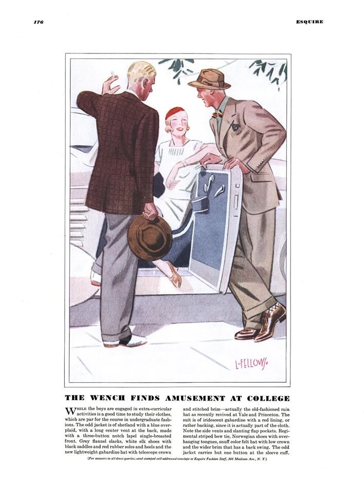
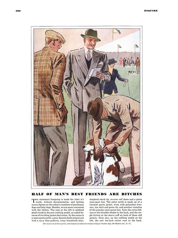
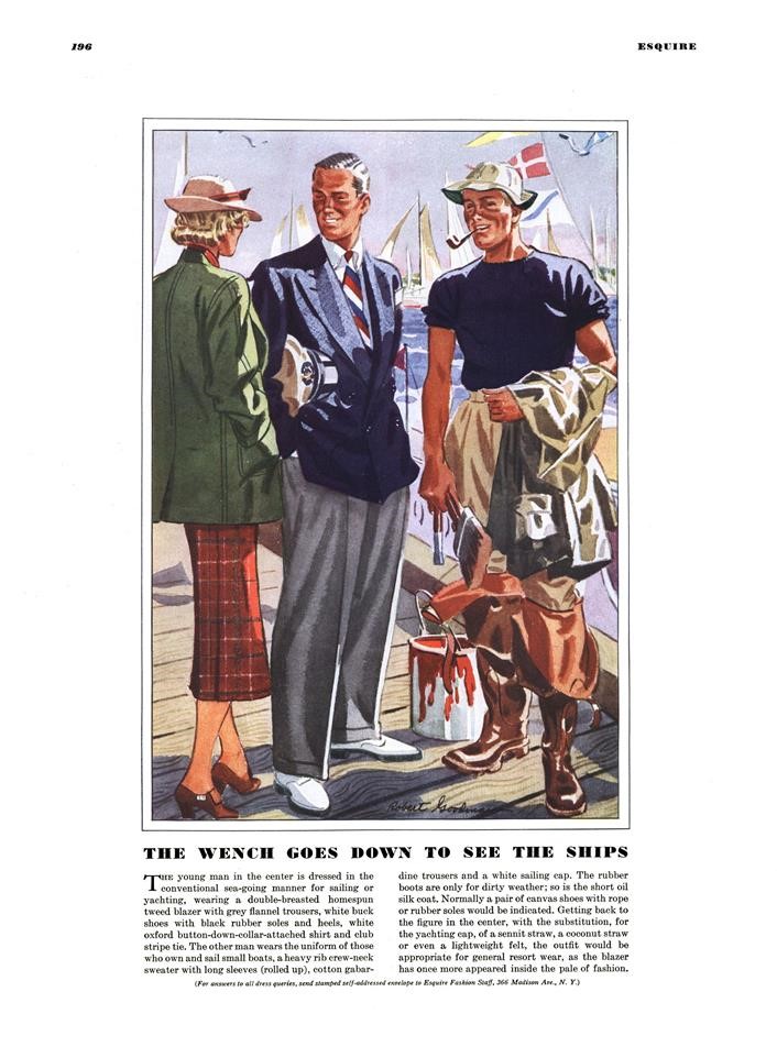
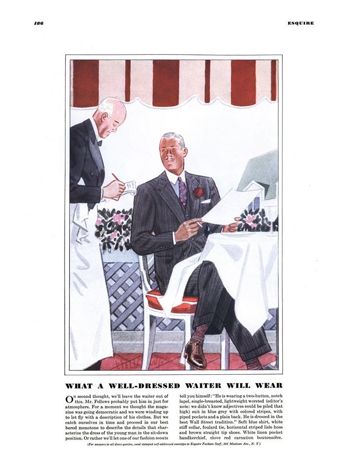
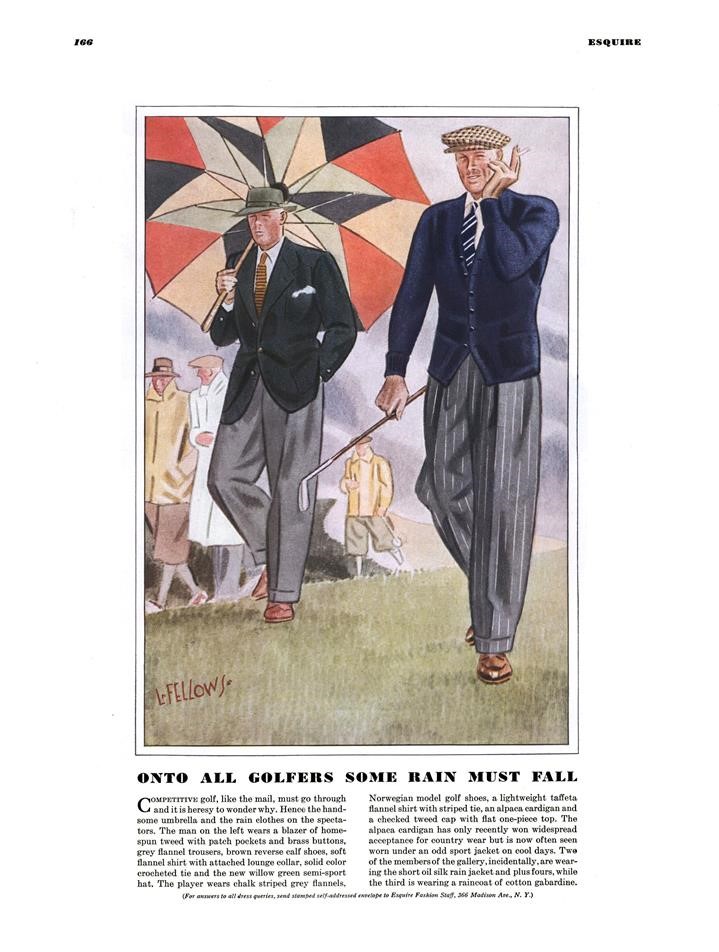
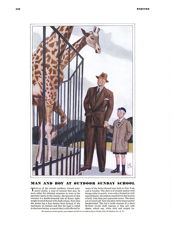
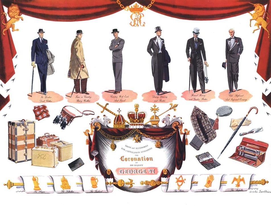
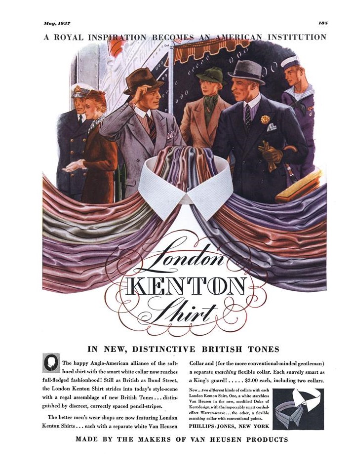
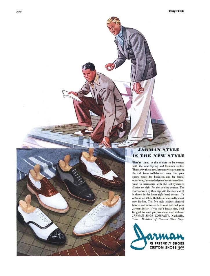
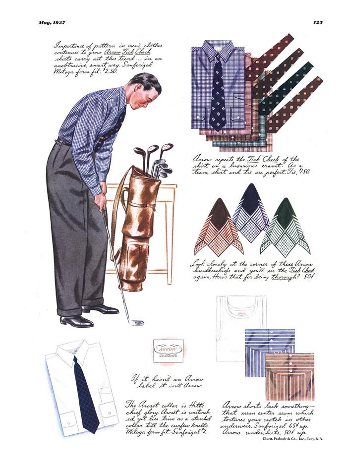
In the dictionary, next to "fluid body," should be a picture of the woman in this illustration. Also, it's a very F. Scott Fitzgerald scene:
View attachment 260860
Yes, yes, excellent raincoats, but the curved mullion windows of the store are beautiful architecture (and reflect outstanding illustrating skills):
View attachment 260861
Fellows isn't even being that subtle anymore. This has a real "Brideshead Revisited" echo. BTW, I like the tan suit with the white bucks.
View attachment 261067
Great illustration of great clothes! I particularly fancy the forest green socks, and such illustrations are making resisting my snazzy sock purchasing compulsion daily more difficult to resist. I find it sadly humorous that several years ago the men's fashion industry entirely confused the smart, vibrant and classic colors and patterns of the socks depicted here and elsewhere during this period, and began instead making ones that were both dumb and ugly, believing that simply being garish was the essential desirable attribute.
I once read a report that J. C. Leyendecker took an interest in the welfare of his junior colleague Fellows, and encouraged him in dealing with the common difficulties of life.
Spot on about the socks. Today's men's fashion industry completely misunderstood the '30s socks and instead "sold" men on the story that garish socks were a way to show they were a nonconformist rebel at heart. One, it's just a stupid idea and, two, the result were a bunch of otherwise reasonable well-dressed and mainly younger businessmen wearing ugly looking cartoon socks.
Many previous bastions of style and taste such as Paul Stuart even succumbed. My idea of an interesting casual sock is more in tune with such.
View attachment 261192
Funny you mention Paul Stuart as that is where (on sale) I bought most of my nice, more-interesting and Apparel-Arts-like socks. But they weren't garish or loud; they didn't make a statement or say "I'm a rebel;" they just enhanced an outfit, like the one in your pick, through texture, or pattern or color, but always, harmonized with the rest of the outfit.
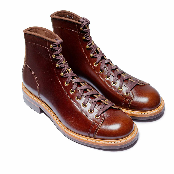 John Lofgren Monkey Boots Shinki Horsebuttt - $1,136 The classic monkey boot silhouette in an incredibly rich Shinki russet horse leather.
 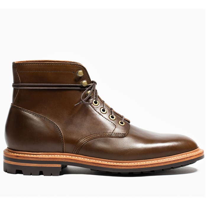 Grant Stone Diesel Boot Dark Olive Chromexcel - $395 Goodyear welted, Horween Chromexcel, classic good looks.
 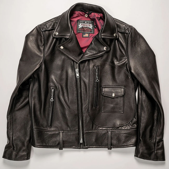 Schott 568 Vandals Jacket - $1,250 The classic Perfecto motorcycle jacket, in a very special limited-edition Schott double rider style.
 The diamond pattern is a beautiful pattern that seems to have been forgotten today:
View attachment 261502
Back in the summer of 2018, I went to a Brooks Brothers 100-year anniversary exhibit at Grand Central Station that included this 1940s suit from its collection:
View attachment 261501
And a close-up of the pattern:
View attachment 261503
I have nothing but respect for Fellows' work, but he might have lost a bit of control of his scale on the man and women to the far left, note the shoulders on each (great polo coat though):
View attachment 261504
I very much like the generous cut of the trousers in the 30s, and that they are high-waisted. Generally, menswear seemed a little looser and more comfortable back then. I disagree that that relaxed cut was prone to look sloppy in real life. But then again, my biggest complaint about the last few year’s styles is in regard to skinny cut trousers on men. Regarding the socks, I agree completely: a subtle and interesting texture goes a long way.