Flanderian
Practically Family
- Messages
- 833
- Location
- Flanders, NJ, USA
The are the Esquire illustrations for August 1942.
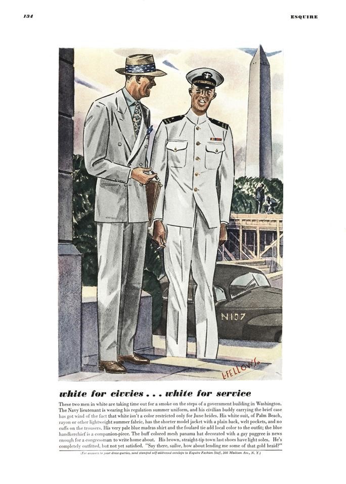
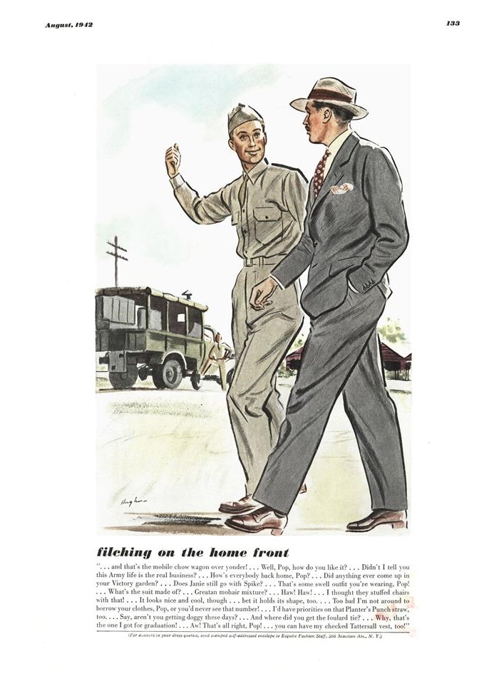
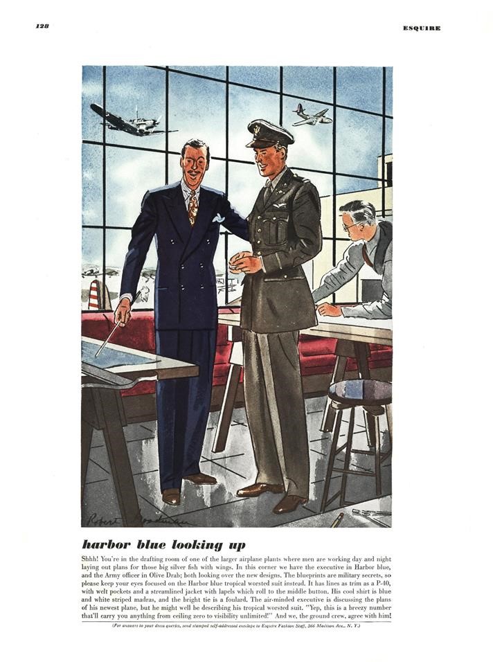
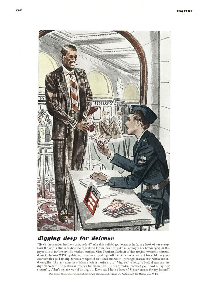
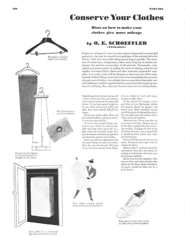
I know I live in a world colored by cliches, but now that uniforms are being sprinkled in, its beginning to feel more like the 1940s to me. They look very sharp too.
What is on that gentleman’s sleeve in the McGregor ad?
It's really amazing how much better the clothes and people look in the illustrations than in real-life shots.
View attachment 270691 View attachment 270692
I'm getting, at least, an echo of our old friend the diamond pattern in that sport coat:
View attachment 270693
Agreed. Partly the product of more talented illustrators than photographers, partially reality. As a long term Paul Stuart catalog addict, the perfect model in the hands of an ultra talented photographer, can yield similar effects. But the Esquire photos aren't 7 foot tall guys, or necessarily those with a 30 inch waist.
Paul Stuart back in the day -
View attachment 270889
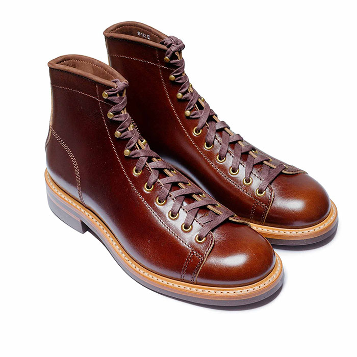 John Lofgren Monkey Boots Shinki Horsebuttt - $1,136 The classic monkey boot silhouette in an incredibly rich Shinki russet horse leather.
 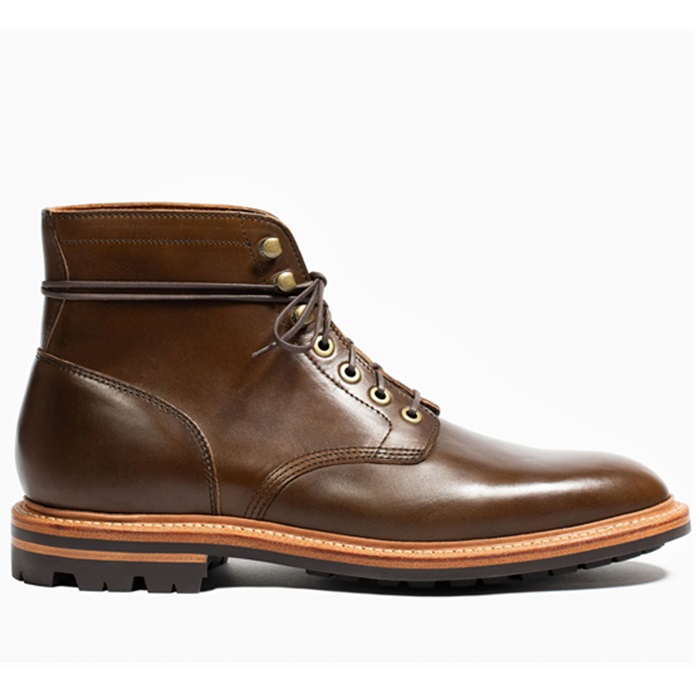 Grant Stone Diesel Boot Dark Olive Chromexcel - $395 Goodyear welted, Horween Chromexcel, classic good looks.
 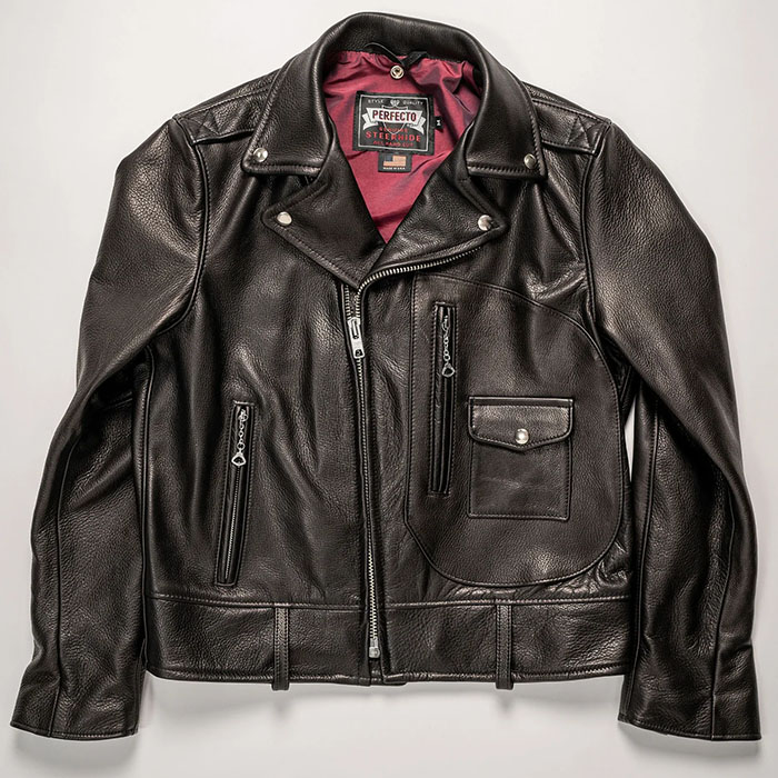 Schott 568 Vandals Jacket - $1,250 The classic Perfecto motorcycle jacket, in a very special limited-edition Schott double rider style.
 An outstanding suit and raincoat and, well, tie and shirt and luggage and car and building - you get the point. Usually, when I love one of these illustrations, it turns out to be a Fellows, so I was a bit surprised this one was a Leslie Saalburg, but only a bit, as he is a close second on my list of favorites.
View attachment 271239
I take it that last is the male equivalent of the curtains matching the drapes.