Want to buy or sell something? Check the classifieds
-
The Fedora Lounge is supported in part by commission earning affiliate links sitewide. Please support us by using them. You may learn more here.
You are using an out of date browser. It may not display this or other websites correctly.
You should upgrade or use an alternative browser.
You should upgrade or use an alternative browser.
M.C. Gannon Hat Company
- Thread starter moontheloon
- Start date
Featured products
-
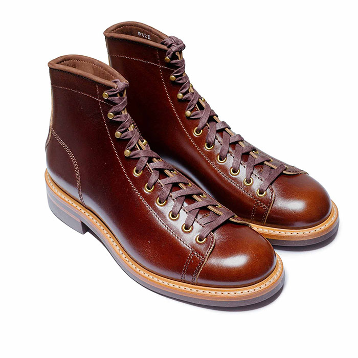
 John Lofgren Monkey Boots Shinki Horsebuttt - $1,136 The classic monkey boot silhouette in an incredibly rich Shinki russet horse leather.
 -
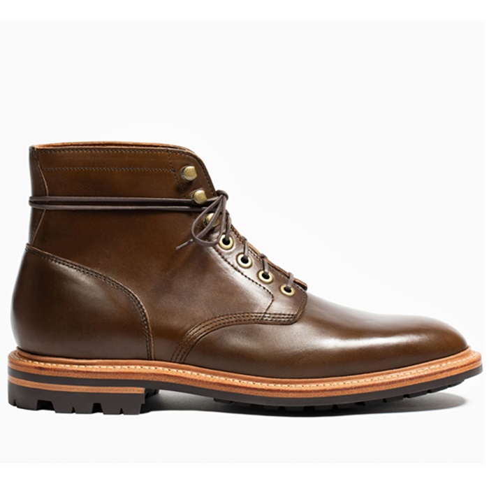
 Grant Stone Diesel Boot Dark Olive Chromexcel - $395 Goodyear welted, Horween Chromexcel, classic good looks.
 -
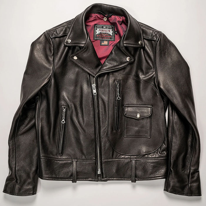
 Schott 568 Vandals Jacket - $1,250 The classic Perfecto motorcycle jacket, in a very special limited-edition Schott double rider style.
Michael R.
Call Me a Cab
- Messages
- 2,889
- Location
- West Tennessee USA
Remind me, Michael, what color ribbons did you go with?
Remember @KY Crusader ? He has a natural with "kangaroo" ribbon that's nice, too.
The Ribbon and Binding was Tan . I'll see if I can post a pic .
- Messages
- 12,131
- Location
- East of Los Angeles
I agree, so it's not just you. In fact, I'll take it a step further--the brim binding should be color matched to the felt, period. Just me.If your ribbon is not going to exactly match the brim binding then the brim binding must match the hat color exactly. Just me.
Bob Roberts
I'll Lock Up
- Messages
- 11,201
- Location
- milford ct
LOL!!!I agree, so it's not just you. In fact, I'll take it a step further--the brim binding should be color matched to the felt, period. Just me.
ChicagoWayVito
Practically Family
- Messages
- 699
Another option here would be to have an underwelt treatment done on the brim instead of the bound edge. I have two underwelted hats and really do like them. It does add a little bulk at the edge though. Not sure if Michael is setup for doing welted brims or not though.
- Messages
- 12,384
- Location
- Albany Oregon
+1 I went with a felt matching binding on my Navy Gannon, to give it a more formal look. My next Gannon will be all about the matching of the ribbon and a more casual, showy look.I agree, so it's not just you. In fact, I'll take it a step further--the brim binding should be color matched to the felt, period. Just me.
Bob Roberts
I'll Lock Up
- Messages
- 11,201
- Location
- milford ct
I like underwelts.Another option here would be to have an underwelt treatment done on the brim instead of the bound edge. I have two underwelted hats and really do like them. It does add a little bulk at the edge though. Not sure if Michael is setup for doing welted brims or not though.
Bob Roberts
I'll Lock Up
- Messages
- 11,201
- Location
- milford ct
I often like contrasts but just not 3 or 4 going on at the same time, lookin like a tossed salad.+1 I went with a felt matching binding on my Navy Gannon, to give it a more formal look. My next Gannon will be all about the matching of the ribbon and a more casual, showy look.
Bob Roberts
I'll Lock Up
- Messages
- 11,201
- Location
- milford ct
I find this color chart helpful in choosing colors I find most aesthetically pleasing.

Hope some find it helpful.
Sent from my SM-N900V using Tapatalk
I remember now. Thanks, Michael. Great hat!
- Messages
- 12,131
- Location
- East of Los Angeles
I like contrasts between the ribbon and the felt, but when the brim binding contrasts as well (regardless of whether or not it's color matched to the ribbon) to me it often "cheapens" the look of the hat and makes it look like a costume item that would be worn in a 1930s-50s musical. But I have rather conservative tastes in many areas, so, again, just me.I often like contrasts but just not 3 or 4 going on at the same time, lookin like a tossed salad.
- Messages
- 19,581
- Location
- Funkytown, USA
Slight hijack to the thread, but I get many compliments on this hat, which is light blue, with a wine brim binding and black ribbon. I think the color combo is unique and impressive.

Everyone has their preferences. I love the looks of a classy Homburg, but think I look like a clown in mine (which I'm probably wearing to a funeral today).
I personally think the subtle contrast is killer cool and classy to boot, like these two from Bob Jesse @navarre of Black Sheep Hat Works. The first one with a half blind stitch on the brim binding.


.
I personally think the subtle contrast is killer cool and classy to boot, like these two from Bob Jesse @navarre of Black Sheep Hat Works. The first one with a half blind stitch on the brim binding.


.
So it is! Great look. Love that blue colour.Slight hijack to the thread, but I get many compliments on this hat, which is light blue, with a wine brim binding and black ribbon. I think the color combo is unique and impressive.
View attachment 90046
These do look stunning. Both of them.Everyone has their preferences. I love the looks of a classy Homburg, but think I look like a clown in mine (which I'm probably wearing to a funeral today).
I personally think the subtle contrast is killer cool and classy to boot, like these two from Bob Jesse @navarre of Black Sheep Hat Works. The first one with a half blind stitch on the brim binding.


.
+1These do look stunning. Both of them.
Richard Morgan
One Too Many
- Messages
- 1,642
- Location
- Central Tesxas
That's a beauty Michael. It looks a lot like the Santa Rosa Gannon had in his "ready to wear" hats.
Richard Morgan
One Too Many
- Messages
- 1,642
- Location
- Central Tesxas
I just emailed Michael about ribbons. He has put on the brim binding and flanged it so it was time to make the final choice. I requested photos of both a 3/8" ribbon and a 13/16. They both look great, but I decided to stick with my original intention of doing an OR style hat and go with the 3/8. 5 1/2" open crown and 2 3/4" brim.
I'm liking the contrast between the camel felt and the char brown ribbons.
The two photos 13/16 first.


I'm liking the contrast between the camel felt and the char brown ribbons.
The two photos 13/16 first.


Richard Morgan
One Too Many
- Messages
- 1,642
- Location
- Central Tesxas
Thank you Doug, I think it will. How close are you on your natural? Should be about the same stage, no?I love the look of the felt. That's going to turn out nicely.
Similar threads
- Replies
- 2
- Views
- 3K
Members online
- Mean Eyed Matt
- Jasonissm
- gily
- Evan1996
- Shawnziee
- Wellfounded_60
- SpruceMoose
- Luc Punksblood
- zebedee
- r.jenkins0912
- dinhnguyen57
- Jfk1117
- tmitchell59
- Marc Fischetti
- pillepalle123
- Dortreo
- BarryMcCockiner_PhD
- Bercor
- theeprimitivesound
- Yellow
- NYDRH
- Mankohouse
- LeatherHunter
- Vladyslav
- BDL
- Olumin
- Kenmar8181
- indyana_jones
- mattmostlydragons
- Khilij
- jeffgarf
- Tomwiththeweather
- torfjord
- red devil
- Guppy
- ragtime_joe
- Fading Fast
- Daniele Tanto
- stmike
- Tom71
- wlsn
- Gareth
- barthestole
- diglettdigs
Total: 4,538 (members: 60, guests: 4,478)

