Want to buy or sell something? Check the classifieds
  • The Fedora Lounge is supported in part by commission earning affiliate links sitewide. Please support us by using them. You may learn more here.

Forgotten Advertising Characters of the Era

LizzieMaine

Bartender
Messages
33,835
Location
Where The Tourists Meet The Sea
Here's another cartoon variation on the "labels come to life" theme from 1935. You'll see some of the animation is directly reused from the previous short, but there are also some new bits, including an Eddie Cantor caricature singing the future Merrie Melodies theme song, sort of, and a rather bizarre Willie The Penguin chorus line.


I don't normally like cartoons where a cat is the villain, but I'll give this one a pass if only for the two-color Technicolor. "Oh look, we can use red and green." And the Bon Ami chick does a reasonable impersonation of the Pathe rooster at the end.
 

LizzieMaine

Bartender
Messages
33,835
Location
Where The Tourists Meet The Sea
That's an interesting observation and - away from Nipper and the kilowatt guy - I agree as, to me, most of them feel "off" and some outright creepy, but IMHO, this is another example of how images, impressions, context, views, vibes in cultures change overtime.

I'm pretty comfortable that era's Boys From Marketing weren't producing advertising images that the general public back then felt were creepy. Clearly most were successful and probably created the same general good vibe that most feel today toward the Geico Gecko or Snoopy.

Writ large, it's why we should be humble when judging things from another era by today's standards. It's reasonably harmless when we say those advertising images look creepy (but as noted, probably weren't viewed that way when they were popular), but is more problematic when we apply all our modern political and social pieties to judging people and norms from other time periods.

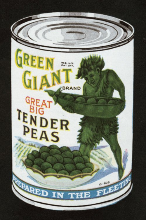
Complete aside, I haven't seen the Jolly Green Giant or Little Sprout in a long time - are they still being used?

I think the thing about the old-time characters that's different is that they weren't the product of scientific marketing research and focus grouping -- today everything in advertising is filtered thru that whole system that didn't yet exist in the early years of the century. The Boys were still in knee britches in the 1910s and 20s, and didn't really graduate to long pants until the 1950s. If something struck somebody cute or funny, especially in the earlier years, it got used.

The Giant is still rampant on labels, but I don't think he's been seen in commercials since the '80s or so. And the Sprout probably grew up and disappointed his dad by going off to live in Williamsburg as a handlebar-moustache-wearing penny-farthing rider with a man-bun.

The Giant, by the way, used to be much more feral looking than he became in the 1950s -- they had to slick him up considerable for television.

tumblr_mzd5zdKZcJ1s3zerco1_500.jpg
 

scottyrocks

I'll Lock Up
Messages
9,178
Location
Isle of Langerhan, NY
That's an interesting observation and - away from Nipper and the kilowatt guy - I agree as, to me, most of them feel "off" and some outright creepy, but IMHO, this is another example of how images, impressions, context, views, vibes in cultures change overtime.

I'm pretty comfortable that era's Boys From Marketing weren't producing advertising images that the general public back then felt were creepy. Clearly most were successful and probably created the same general good vibe that most feel today toward the Geico Gecko or Snoopy.

Writ large, it's why we should be humble when judging things from another era by today's standards. It's reasonably harmless when we say those advertising images look creepy (but as noted, probably weren't viewed that way when they were popular), but is more problematic when we apply all our modern political and social pieties to judging people and norms from other time periods.

Complete aside, I haven't seen the Jolly Green Giant or Little Sprout in a long time - are they still being used?

Yes, I am aware of this, having written a post-graduate thesis dealing with historical empathy. I just thought they were creepy. :)
 
Messages
17,269
Location
New York City
Yes, I am aware of this, having written a post-graduate thesis dealing with historical empathy. I just thought they were creepy. :)

I'm sorry, I did mean to come off as saying you didn't know this stuff, just trying to bring it out as a point overall.

I think the thing about the old-time characters that's different is that they weren't the product of scientific marketing research and focus grouping -- today everything in advertising is filtered thru that whole system that didn't yet exist in the early years of the century. The Boys were still in knee britches in the 1910s and 20s, and didn't really graduate to long pants until the 1950s. If something struck somebody cute or funny, especially in the earlier years, it got used.

The Giant is still rampant on labels, but I don't think he's been seen in commercials since the '80s or so. And the Sprout probably grew up and disappointed his dad by going off to live in Williamsburg as a handlebar-moustache-wearing penny-farthing rider with a man-bun.

The Giant, by the way, used to be much more feral looking than he became in the 1950s -- they had to slick him up considerable for television.

tumblr_mzd5zdKZcJ1s3zerco1_500.jpg

Fair points, but I would think they did market research and post-launch surveys at least by the '20s (I think I've read as much), so that these characters must of had some sort of general appeal and not come across as creepy as they do to many of us today - no?

And, darn, that Green Giant is, as you said, much more aggressive / cave-man like than the one I grew up with. But as to Sprout, couldn't he stay a Sprout forever like the Peanuts kids :).
 

LizzieMaine

Bartender
Messages
33,835
Location
Where The Tourists Meet The Sea
Speaking of the Pathe rooster, he's lasted for a very long time -- he started in France around the turn of the century and is still in use today.

GW300H226


He came to the US in the 1910s, and was a common sight thruout the silent era.

GW430


He was at his best when working for Pathe News -- in the '30s he came at the end of the newsreel, right after the performing dogs, dancing horses, flagpole sitters, or clowns jumping out of little cars:


You'd occasionally see him on features after Pathe Exchange merged with RKO --


But he was at his most dynamic after Warner Bros. bought the Pathe News operation in the late 1940s -- even though Warners took top billing.


You still see him today, with Pathe a leading distributor of British independent films:

Pathe-logo.jpg
 

LizzieMaine

Bartender
Messages
33,835
Location
Where The Tourists Meet The Sea
But for movie logos, and for creepy, you'd be hard pressed to surpass this one:


The young lady is Miss Claudia Dell, a musical-comedy stage performer who came to Hollywood in 1929 to star in filmed operettas -- the market for which immediately collapsed, leaving her to seek other employment. Life is sometimes very sad.
 

Nobert

Practically Family
Messages
832
Location
In the Maine Woods
Maybe it's just me, but the great majority of these characters are just downright creepy.

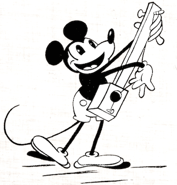
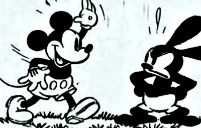
It's not just you, standards of what seems attractive, approachable, or cute altered noticeably in the past century and change. The evolotionary theorist Stephen Jay Gould has a great essay on the evoloving neotony of Mickey Mouse, in which he measures the size of his head, ears, eyes and snout relative to overall height from the Steamboat Willy model up to when he was palling around with Annette Funicello, and notes that he became, Benjamin-Button-like, more and more infantile as he aged.

Psyche, the White Rock Girl, is well within living memory (even I've seen the Ernie Kovacs spoof where she falls in the pond), but before she came into her mid-century Tinkerbell look, she had two major overhalls. The lady who was the face of Sozodont, a wood-engraved image of a handsome, smiling woman, was outdated by the twentieth century, going from toothsome to just toothy, and looking a bit sinister.*

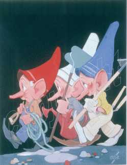
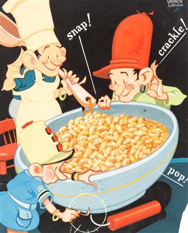
If a characters get enough traction to remain profitable, they will evolve, leading to some left-over shades of Madison Avenue. One trope that seems to formerly have been quite popular was elves, who are still around to some degree, but were even more prevelant once-upon-a-when. Vernon Grant, a popular illustrator, drew them often:
6207626.gif


Grant was even faced with legal action from Kellogg's for impugning upon the trademarked Snap, Crackle and Pop.
vernon-grant-snap!-crackle!-and-pop.jpg


He beat the rap by the good fortune of having been the one who designed the Rice Krispie elves in the first place.

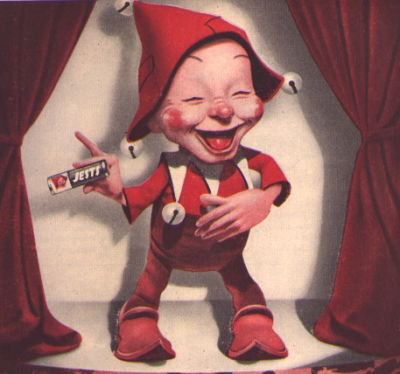
Of those that didn't last there's the mascot for Jets stomach pills, who frankly looks as though he's merely laughing through the dyspepsia.
Jets.png

And, speaking of creepy, there's Bobby Bostich who, just by the look of him, I wouldn't let within twenty yards of me with a stapler. Those cherubic wings don't fool me, this sylvan Scutt Farkis clearly has a look in his eye that bespeaks of malice aforethought.
Bostich.png


Edit: "Yes, I am aware of this, having written a post-graduate thesis dealing with historical empathy. I just thought they were creepy. ":)

Sorry, I started writing this post before I saw your response. I'm sure you know more on the subject than I do.

*The info in this paragraph comes straight from They Laughed When I Sat Down, Frank Rowsomes Jr.'s history of advertising, Bananza Books, 1959.
 
Last edited:

LizzieMaine

Bartender
Messages
33,835
Location
Where The Tourists Meet The Sea
Another good example of that phenomenon is Porky Pig, who went from this --

hqdefault.jpg


To this --

bd0d02ea271cdaec36a026755fc1401b--merrie-melodies-the-early-years.jpg


To this --

Clampett-Porky.jpg


To this --

hqdefault.jpg


Subtle, but obvious. Original Porky is fat in a slobby, greasy way -- Eventual Porky is fat in a cute li'l chubby cheeks way.
 
Messages
17,269
Location
New York City
But for movie logos, and for creepy, you'd be hard pressed to surpass this one:


The young lady is Miss Claudia Dell, a musical-comedy stage performer who came to Hollywood in 1929 to star in filmed operettas -- the market for which immediately collapsed, leaving her to seek other employment. Life is sometimes very sad.

An example of not being subtle and why it, IMHO, doesn't work. Versus, say, the awesome Pathe Rooster - who, QED, has had a much better career.
 
Last edited:
Messages
17,269
Location
New York City
Disneyfication run amok.

I sincerely hate what they did to poor Whinie the Pooh. I can't stand the "new" image. Not only is it outright ugly and stupid (no I can't defend why it's stupid, it just is :)), the original image was so perfectly elegant and appropriate for the character. So that was a Disney thing - ugh?
 

LizzieMaine

Bartender
Messages
33,835
Location
Where The Tourists Meet The Sea
Disney got the animation rights for Pooh in the '60s, and turned out a bunch of featurettes for "The Wonderful World of Disney," which weren't horrible as such things go -- they were far less cloying than the Pooh stuff they have done more recently, which seems more designed to promote merchandise than to do any kind of a meaningful story.

The rights to Pooh are a mess, between the Milne estate and Disney, and there has been quite a bit of hard-boiled litigation over them over the years, going back to the original assignment of US rights by Milne to a slick merchandising promoter who later "assigned" them to Disney, but the promoter's estate claimed Disney was cutting them out of royalties and it got nasty. The Milnes haven't been any too pleased with the situation, either. Kind of distasteful for something as innocent as Pooh to get caught up in such muck, but such is the way of the world.
 

ChiTownScion

Call Me a Cab
Messages
2,245
Location
The Great Pacific Northwest
Disney got the animation rights for Pooh in the '60s, and turned out a bunch of featurettes for "The Wonderful World of Disney," which weren't horrible as such things go -- they were far less cloying than the Pooh stuff they have done more recently, which seems more designed to promote merchandise than to do any kind of a meaningful story.

The rights to Pooh are a mess, between the Milne estate and Disney, and there has been quite a bit of hard-boiled litigation over them over the years, going back to the original assignment of US rights by Milne to a slick merchandising promoter who later "assigned" them to Disney, but the promoter's estate claimed Disney was cutting them out of royalties and it got nasty. The Milnes haven't been any too pleased with the situation, either. Kind of distasteful for something as innocent as Pooh to get caught up in such muck, but such is the way of the world.


The only Disney Pooh character I ever tolerated was the little jackass, Eeyore. Perhaps because he wasn't quite as cloyingly sweet as the rest of them. Just like on that TV drama that so many went crazy over- Little (Out)House on the Prairie. The only one that I liked was the bratty kid.

upload_2017-10-12_13-43-1.png
 

Nobert

Practically Family
Messages
832
Location
In the Maine Woods
I'm going to throw in a few more here just because, inspired by this thread, I went and perused the ads in my old magazine collection for examples. This took some time, as they were occasionally punctuated by content, and I don't want to waste the effort.

As previously mentioned, some mascots surely faded away just because their products didn't last. You can look for the Champion Knight all you want, I don't think the adding machine is primed for a comeback.
Victor Champion.png


I don't know whether the Royal Wire company is still around. I also don't know whether "Royal Jim" was a regular mascot or a one-off just for this ad:
Royal Wire.png


Likewise, this pothead:
Brillo.png


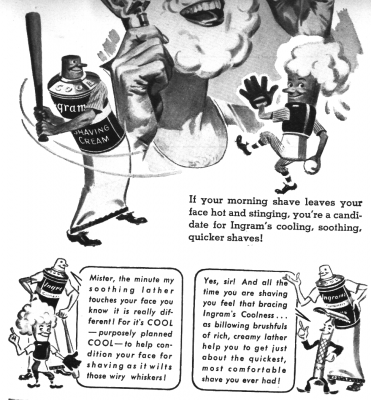
Having a mascot that is actually an anthropomorphed version of the product may also have its hazards. I don't think many people use shaving cream out of tubes anymore. I don't know if Ingram's survived into the television era, but I'm imagining a jingle that's a variation of Fats Waller's Squeeze Me.
Ingram's.png

Some mascots are just ahead of their time. Forty-five percent of the internet not withstanding, if you've ever tried to put so much as a pair of sunglasses on a cat, you can see why these Mohawk pillowcase felines would be difficult to work with.
Mohawk.png


The creator of this campaign no doubt died in a fall stemming from some soiled-slipper mishap.
 
Last edited:

Forum statistics

Threads
109,667
Messages
3,086,322
Members
54,480
Latest member
PISoftware
Top