HosManHatter
One of the Regulars
- Messages
- 207
- Location
- Northern CA
Killer Stetson,AXL. I`m not a thin ribbon fan but I would not modify the Stratoliner...rare or not.
HMH
HMH
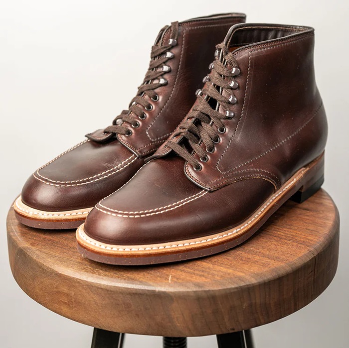
 Alden 403 Moc Toe Boot - Brown Chromexcel - $680 The classic "Indy" style Alden Boot in the classic Horween brown Chromexcel.
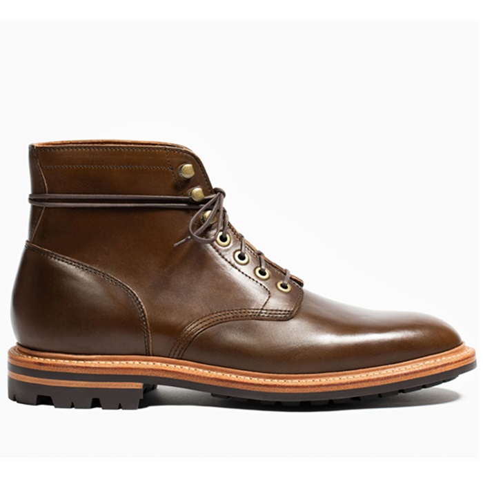
  Grant Stone Diesel Boot Dark Olive Chromexcel - #395 Goodyear welted, Horween Chromexcel, classic good looks.
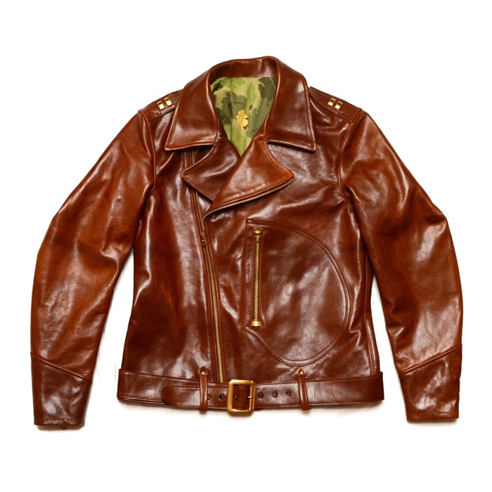
  Himel Bros. - The Ross Mk. 1 Leather Jacket Classic D-pocket motorcycle/aviator style jacket.