- Messages
- 15,089
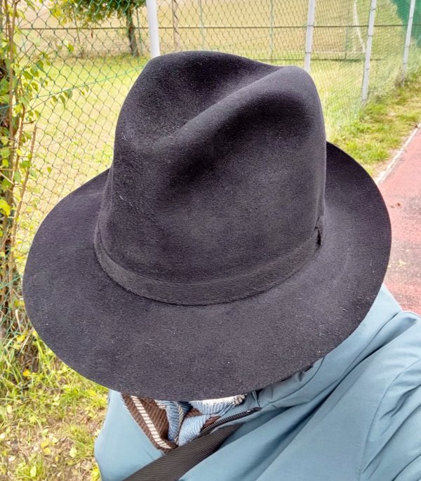
Oooh that’s nice, Bob! I assume the felt is gray but it has a greenish hue in the sunlight on my screen. It’s a good looker.
Thanks Reggie! It does have green tones, but they are a bit hard to capture.
Oooh that’s nice, Bob! I assume the felt is gray but it has a greenish hue in the sunlight on my screen. It’s a good looker.
Wow. Love that.Heading to breakfast in a Supper Club.
View attachment 559660
View attachment 559666
View attachment 559667
View attachment 559669
Wow. Love that.



That is very kool!!! Beautiful color combo.
Hi Daniele, so what is the difference in the modern Marengo Fur?Max, as I have already said in other posts and here I repeat, Borsalino had no classification given by names or abbreviations of the hats. In modern times the only tangible classification is given by the mixture of fur for special felt (vicuna, beaver, cervelt, guanaco) and by the denomination "Marengo" for the second price range hats. In the past it was the price that determined the quality of the hat, according to its construction, felt and shape. Therefore the words found in the linings of ancient Borsalino or a recent past do not say anything at all. For the American market, marketing strategies have been developed to give the buyer a foothold in the market that American competitors had saturated with names, acronyms and captions for their hats. I have Borsalino marked "Trionfo" that are the opposite of each other like shape, felt and finish and so on for all the denominations that Borsalino has given over the years to his hats. "SuperTrionfo" is one of the variations of the marketing strategies implemented in the past for the American market. As you can see from the Borsalino hats I wear, I never mention what is written on the lining or sweatband, but only the color and the type of hat that is one of the mysteries of Borsalino, because with the same wording there are hats of obvious different shape. Borsalino, like the other Italian producers has always made hats that spoke, for good or bad, for themselves, none of us asks the shopkeeper for a Borsalino such, but simply a Borsalino, no matter what is written inside or outside.
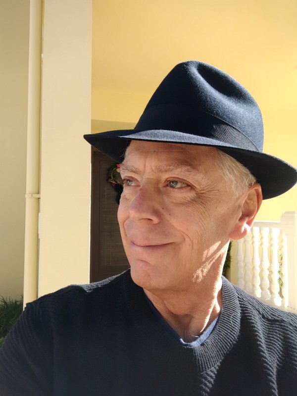
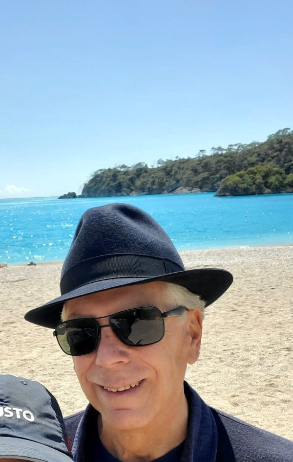
You may not post that often, Reggie, but when you do, you do it in style.Hey all. I have been a little lazy about posting my daily hat pics, so in the spirt of channeling my inner Stefan Stuer here are a few hats from the past couple of weeks.
Borsalino Bellagio in Navy View attachment 559593 View attachment 559592
Kings Lane by Knox View attachment 559595
View attachment 559596
Gannon Hat Co.
View attachment 559597
View attachment 559598 View attachment 559599
JJ Hat Center House brand Velour made by Roche
View attachment 559600
Biltmore Rosellini
View attachment 559603 View attachment 559605
As always, Gary, you both look great in your hats and fine ensemble.Hornskov Rancher for grocery shopping today.
View attachment 559682 View attachment 559683 View attachment 559684
Etsuko was in her Akubra Leisure Time.
View attachment 559685 View attachment 559686
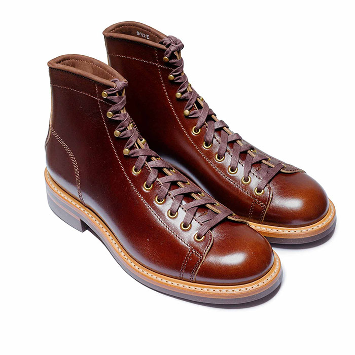 John Lofgren Monkey Boots Shinki Horsebuttt - $1,136 The classic monkey boot silhouette in an incredibly rich Shinki russet horse leather.
 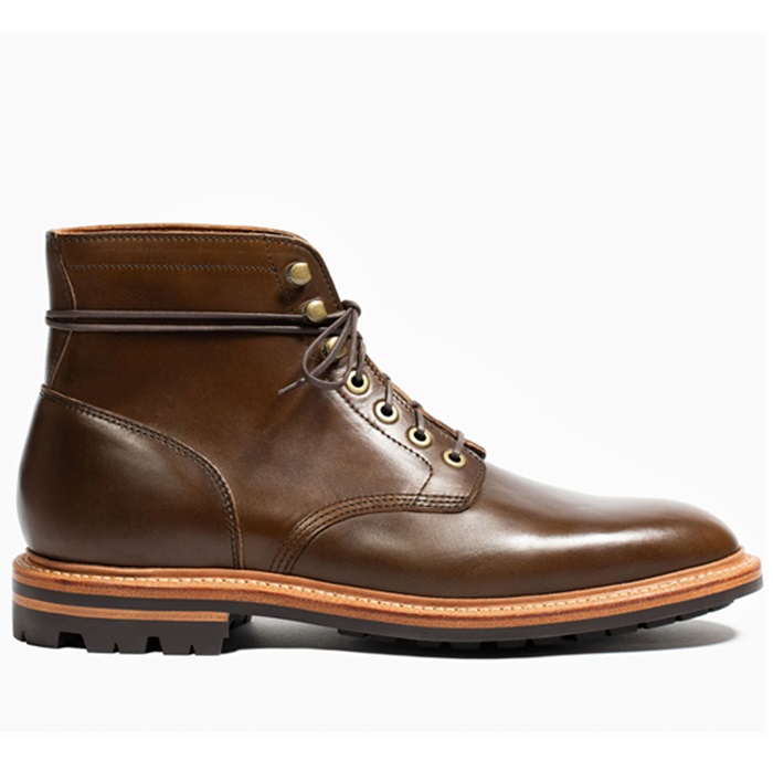 Grant Stone Diesel Boot Dark Olive Chromexcel - $395 Goodyear welted, Horween Chromexcel, classic good looks.
 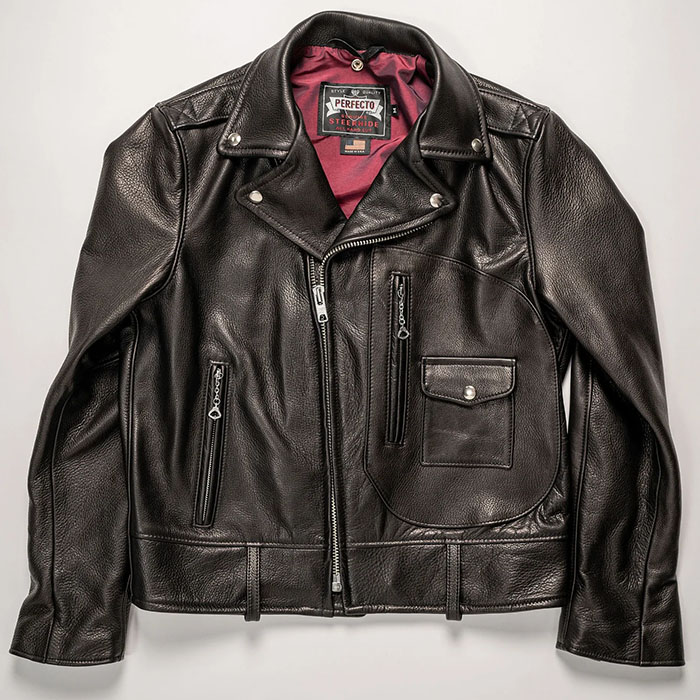 Schott 568 Vandals Jacket - $1,250 The classic Perfecto motorcycle jacket, in a very special limited-edition Schott double rider style.
 Thanks, Steve.As always, Gary, you both look great in your hats and fine ensemble.
Love that Rancher. I've paid my deposit down for my Hornskov, but can't decide which one. I may have to revist the Ranchers.
Ryn'h ca. 1930s wool Fedora.
See Stefan's description below.
Post in thread 'The International Wool Felt Consortium' https://www.thefedoralounge.com/threads/the-international-wool-felt-consortium.91613/post-3047377
View attachment 559779
View attachment 559780
In the eBay thread there was a discussion about the Stetson Mode Edge and a question was raised about a Silverbelly ME. I posted one example of a Sovereign Twenty. In the true color sense I guess it’s really more of a light beige and without a Stetson color chart, i tend to shovel anything close into the SB pile.
I’m pretty sure this one would have been listed and sold as SB. CAN 7X CB ME.
View attachment 559823 View attachment 559824 View attachment 559825 View attachment 559826 View attachment 559827 View attachment 559828
Thank you, David.Beautiful heather—suits you!
Damn. Now, I'm back to square one re choosing my Hornskov.Thanks, Steve.
To be honest, I’ve had a hard time falling in love with this one. I never felt comfortable in the original cattleman crease, so changed it to what you see in yesterday’s photos.
Still not happy, I decided to try giving it a telescope crease. I don’t have a block, so I used my bowler to push it in evenly on the top, then pushed the bubble back out as best I could by hand. The taper prevents It from looking quite like I had hoped, and I still felt uncomfortable with the dead flat brim, so I gave it a bit of curve at the sides.
I think I’ll feel more comfortable with it as it is now (maybe with some refining). I want to love it, because I do love the stone felt & dusty rose ribbon colour combination. View attachment 559785 View attachment 559786