Want to buy or sell something? Check the classifieds
-
The Fedora Lounge is supported in part by commission earning affiliate links sitewide. Please support us by using them. You may learn more here.
You are using an out of date browser. It may not display this or other websites correctly.
You should upgrade or use an alternative browser.
You should upgrade or use an alternative browser.
P-51 Mustang Polo Shirt...feedback sought!
- Thread starter TXFlyGuy
- Start date
Of the two, I'd go for the second, simpler one. It's a cleaner image.
Thank you. Your selection puts you in the 90 percentile of voting!
Of the two, I'd go for the second, simpler one. It's a cleaner image.
Sir, I've lost any and all respect for you.
Seriously, I actually do like the first one better. If you decide to go with the horse please get an extra one made and I will buy it from you. My wife teaches at a school whose teams are the "Mustangs." She would wear it with pride!!
I just got off the phone with the embroidery design people. Unfortunately, the plane with the horse in the background does not lend itself to a "crest" embroidered design. The actual crest will be about 4" maximum, perhaps 3.75".
Here is a design that will work...but the horse is gone. Sorry! Thanks for your input!!!

cordwangler
One of the Regulars
- Messages
- 187
- Location
- UK
I just got off the phone with the embroidery design people. Unfortunately, the plane with the horse in the background does not lend itself to a "crest" embroidered design. The actual crest will be about 4" maximum, perhaps 3.75".
Here is a design that will work...but the horse is gone. Sorry! Thanks for your input!!!
What? Whose $$$s *are* these!
It might be a bit 'busy' for a designer, but of the two it's the better design. The second makes the ensemble too black and yellow: great warning colours, but not so good for wearing.
The first is more old-timey flier, friendlier, and better colours altogether. Bring back the horse!
I'd show 'em some of the more florid WW2 patches and see which elements they'd omit for design clarity
nick123
I'll Lock Up
- Messages
- 6,371
- Location
- California
I prefer the first one. The second one would probably work better as a shirt logo, but the first is a little different/more creative.
The voting is about 80% for the checkerboard, 20% for the horse. Keep in mind the patch you see here is over 5" in diameter. The actual embroidered crest will be 3" diameter, with the rocker panels extending out a bit.
My wife said any thing bigger (she knows about big things!) would be too much.
My wife said any thing bigger (she knows about big things!) would be too much.
Otter
One Too Many
- Messages
- 1,445
I like them both , they each have something going for them. I would probably favour the horse over the chequered version.
EmergencyIan
Practically Family
- Messages
- 918
- Location
- New York, NY
The first one.
- Ian
- Ian
l0fielectronic
Practically Family
- Messages
- 666
- Location
- UK
I like the first image, even without the horse. The second I'm not so keen on.
Featured products
-
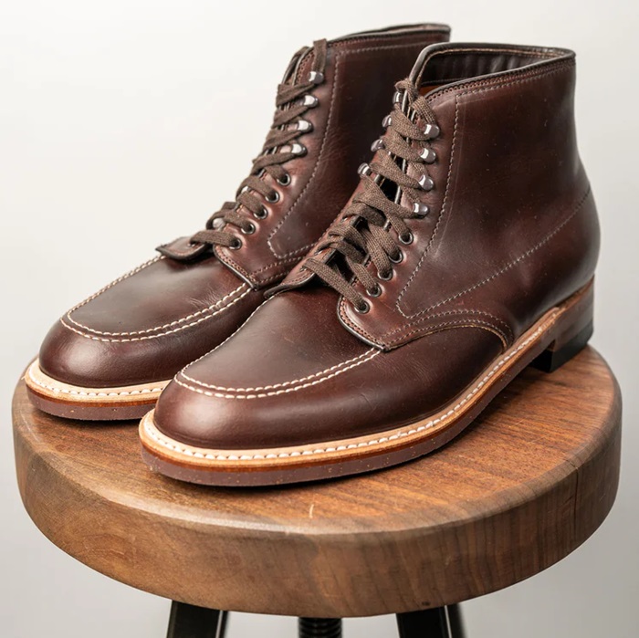
 Alden 403 Moc Toe Boot - Brown Chromexcel - $680 The classic "Indy" style Alden Boot in the classic Horween brown Chromexcel.
 -
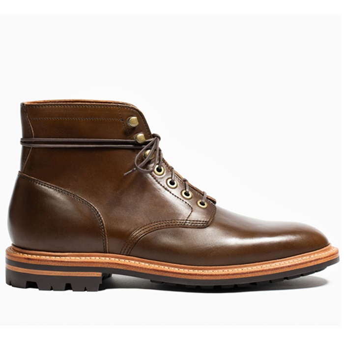
 Grant Stone Diesel Boot Dark Olive Chromexcel - #395 Goodyear welted, Horween Chromexcel, classic good looks.
 -
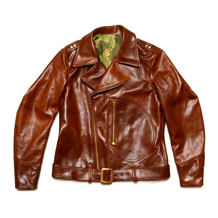
 Himel Bros. - The Ross Mk. 1 Leather Jacket Classic D-pocket motorcycle/aviator style jacket.
I like the first one the best but I think that the P-51 needs to be just a bit darker to seperate it from the background.
And, therein lies the problem. It is a great patch, 339th FG. But it is a bit busy. The other one with the black/yellow checkerboard represents our actual nosebowl paint, plus it has the unmistakeable iconic P-51D profile. Several military pilot friends have said it is easier to identify.
When this gets shrunk down to 3", it will be the better of the two. Right now, the voting is 50/50. The Black & Yellow checker got off to a strong lead, but the horse has come on strong and is making up ground.
I like the first image, even without the horse. The second I'm not so keen on.
If we go with the second one, the "Denton Doll" script will be gone, the plane relocated to the center, with the white cloud background. You have to imagine this as a 3" patch.
Agreed.
Use the first one on the back of your flightjackets.
The embroidery company agreed with your observation. They said to use the plane & horse as a full back painting / patch.
The vote is in...the black/yellow checkerboard won with a 2 to 1 margin. The design will be "tweaked" just a bit. The "Denton Doll" script color will be much darker (never like it), and the bottom tab may look more like a ribbon/banner.
Keep in mind the design will be shrunk by 2 inches. Here is a patch that represents the final size, plus a shirt we did a year ago for the faculty:


Keep in mind the design will be shrunk by 2 inches. Here is a patch that represents the final size, plus a shirt we did a year ago for the faculty:


http://pilots.ualforums.com/customavatars/avatar10424_2.gif
The style will be a bit more like this...
The style will be a bit more like this...
Similar threads
- Replies
- 21
- Views
- 28K
- Replies
- 80
- Views
- 15K
- Replies
- 9
- Views
- 6K
- Replies
- 5
- Views
- 3K
Staff online
-
Nathan FlowersHead Bartender
Members online
- barnabus
- Modified_last_call
- Dlaniger
- Nathan Flowers
- konadog
- mtrlr
- tmitchell59
- Nykwil
- Rgcards
- baldfront
- Team_Feisar
- AerGuitar
- csmorris
- ParkerFM
- steur
- batankyu
- Seank
- voodootomato
- Zoro28
- Joao Encarnado
- TiltRotorFlyer
- bootsonatrain
- Mr. Jackel
- Nickelman2005
- Art Hat1
- Jaymig926
- Cortexas
- Rmccamey
- jeepTj98
- Brandrea33
- borisna
- CaserJonez
- Lheritage
- yeah
- Drzdave58
- Kenmar8181
- Shambhala
- dimag333
- toutoun_08
- Melquíades
- bien
- realgone
- Will Zach
- Ron86
- jchance
- Crotalus500
- The Shoe
- Ken David
- bbarkley
- Steve1857
Total: 4,303 (members: 93, guests: 4,210)

