Want to buy or sell something? Check the classifieds
  • The Fedora Lounge is supported in part by commission earning affiliate links sitewide. Please support us by using them. You may learn more here.

Good Wear Imperial

Superfluous

My Mail is Forwarded Here
Messages
3,995
Location
Missing in action
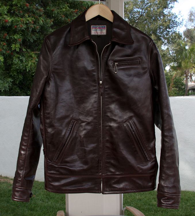
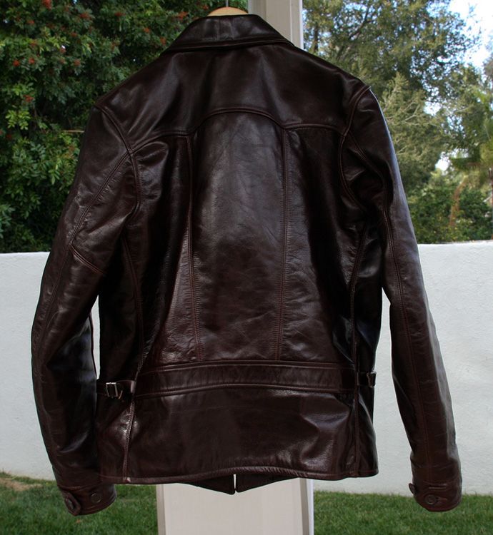
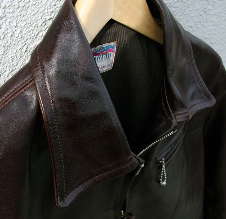
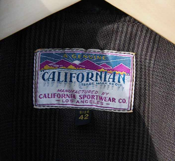
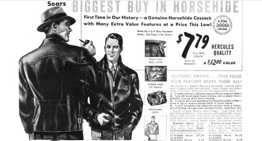
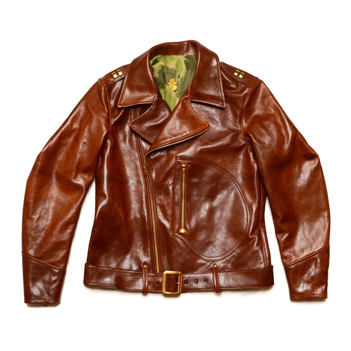
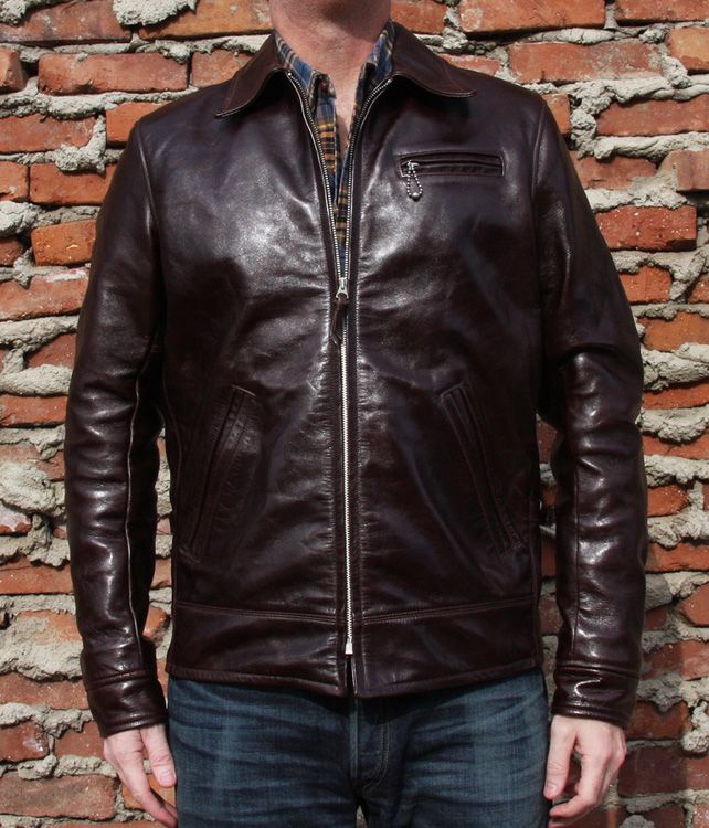
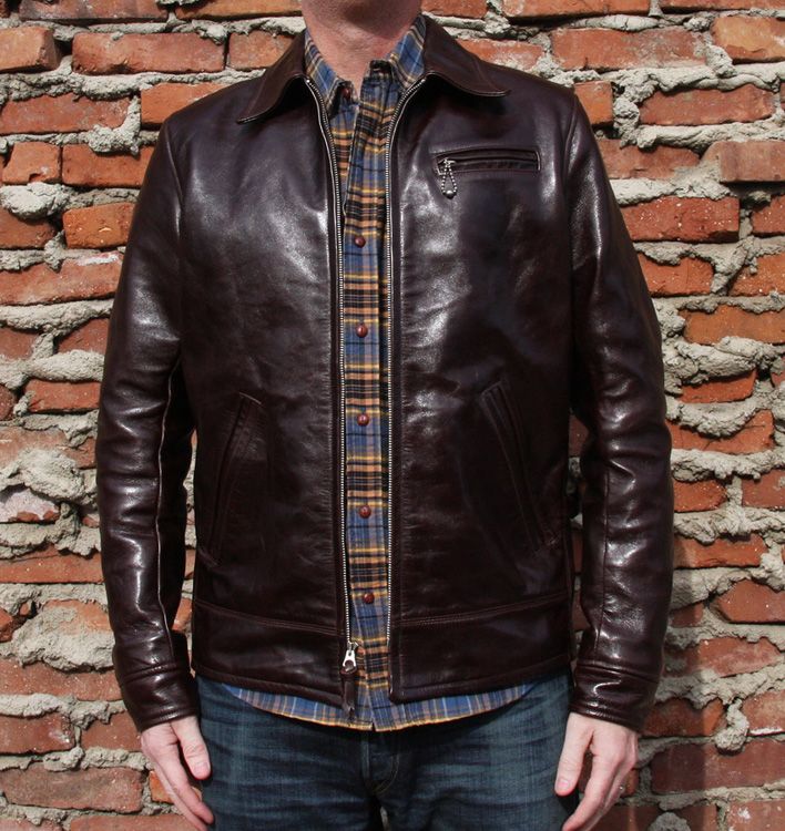
First and foremost, huge thanks to John and Vickie (she is an angel). Thanks also to HandyMike for prompting JC to make the Imperial. I cannot put into words just how pleased I am with this jacket. The Shinki is a rich and vibrant dark brown (as opposed to some dark browns that border on black). The HH is robust and sturdy, but not oppressively rigid. The liner is interesting, but understated. The cut is trim, but comfortable. Lastly, thank you to Sears for coming up with the design 60+ years ago.
GoodwearImperial50_zps32bf02e2.jpg


GoodwearImperial51_zpsbaf664ef.jpg


GoodwearImperial52_zps24f6a0bc.jpg


GoodwearImperial53_zps531e4f7f.jpg


GoodwearImperial54_zpsdf54e8bc.jpg


GoodwearImperial59_zps4c045083.jpg


AdvertisementSears_zpsb7e89378.jpg
 

Sloan1874

I'll Lock Up
Messages
8,427
Location
Glasgow
Okay, I'm going commit heresy here, so, apologies in advance. Lovely colour, but zhz is right: that breast pocket looks way too high, I still think the hw pockets are too big, and, while I'd like to see back pics, the half-belt looks a bit low. It's as if the jacket's being pulled in two directions.
 
Last edited:

Cooperson

One Too Many
Messages
1,165
Location
Midlands UK
Beautiful hide but have to agree, comparing it to the original Sears advert, the breast pocket is way high and the half belt low. I could probably live with the half belt but the position of the breast pocket would be a distraction as it just draws your eye to it. It's a real shame because it's obviously a very beautiful jacket.
 
Last edited:

nick123

I'll Lock Up
Messages
6,371
Location
California
I didn't even notice the position of the chest pocket on the first take. Personally, I think it makes for a unique jacket.
 

thor

Call Me a Cab
Messages
2,009
Location
NYC, NY
Looking at various photos on-line of outer chest/breast pockets, they seem to generally align horizontally with the armpit/nipple axis (anatomically speaking). An inch above or below that horizontal axis probably isn't noticeable but more than that and it becomes more apparent to the casual observation that the pocket is higher/lower then usual.
 
Last edited:

tropicalbob

My Mail is Forwarded Here
Messages
3,954
Location
miami, fl
I didn't even notice the position of the chest pocket on the first take. Personally, I think it makes for a unique jacket.

Neither did I. I wonder if it has something to do with balancing off the belted area at the bottom. Really beautiful jacket.
 

Bunyip

Call Me a Cab
Messages
2,069
Location
Australia
Okay, I'm going commit heresy here, so, apologies in advance. Lovely colour, but zhz is right: that breast pocket looks way too high, I still think the hw pockets are too big, and, while I'd like to see back pics, the half-belt looks a bit low. It's as if the jacket's being pulled in two directions.
That's a really apt description Sloan. The leather looks sensational, and I really do like that design, it just looks a bit out of whack. Mind you, with the beautiful leather and overall quality, it's a winner.
 

Superfluous

My Mail is Forwarded Here
Messages
3,995
Location
Missing in action
The chest pocket is clearly high. That said, a photographer told me privately that my photos accentuate the height of the chest pocket because the photos are taken from a vantage point way below the jacket. In the first two fit pics, I am standing approximately four feet above the photographer. In the non-fit photos, the jacket is hanging from an outdoor light well above me.

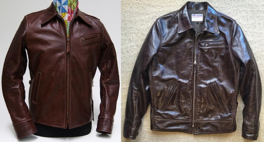
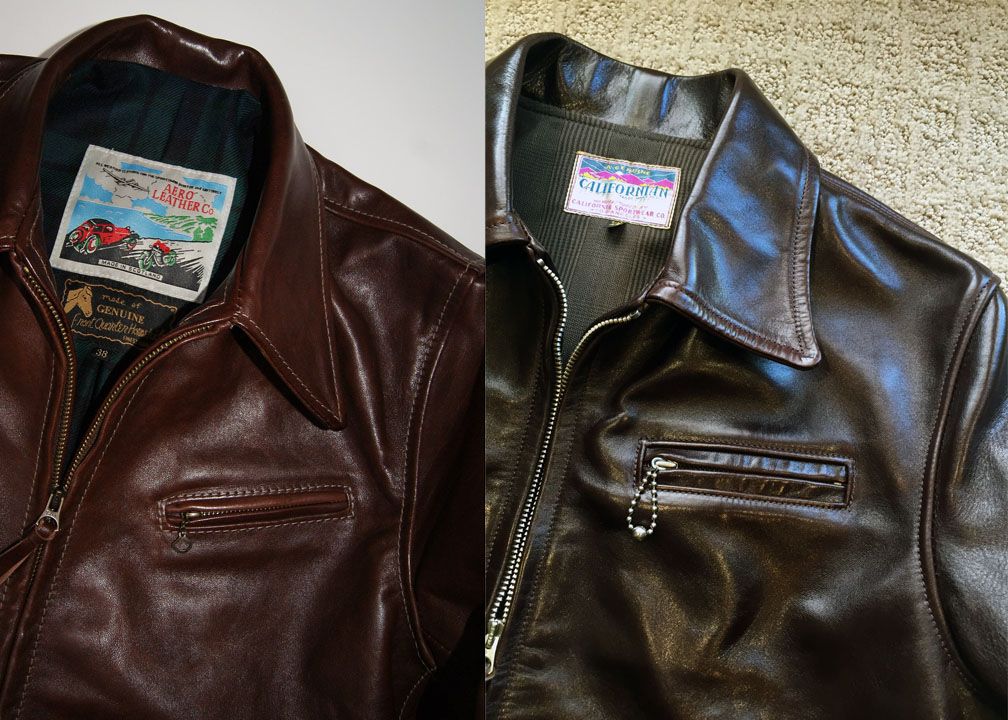
Insurrection recently posted some photos of Aero's (gorgeous) Premier Half Belt ("PHB"). The chest pocket on the PHB is also higher than usual, although the slant to the pocket mitigates the height. Below are a couple of comparison photos. The chest pocket on the PHB may actually start a hair higher, but clearly ends lower.

Compare11_zps86a48a8b.jpg


Compare22_zps369f99be.jpg
 

Staff online

Forum statistics

Threads
109,259
Messages
3,077,475
Members
54,217
Latest member
crazyricks
Top